


Mobile First: Why It Matters
 Mobile First approach is the new standard for web design and online marketing.
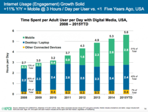
Since 2014, mobile devices have passed the tipping point and become the primary devices for browsing the internet. According to KPCB mobile technology trends by Mary Meeker, the mobile device media time in the United States is now significantly higher at 51% in comparison to desktop (42%). Most people keep their iPhones or Android devices with them at all times, giving them the ability to search the internet immediately and at their convenience. Gone are the days when you had to sit down in front of your computer to search Google for a particular service.
These statistics make the case for the importance of mobile devices in today’s online marketing environment:
- There are over 1.2 billion mobile web users worldwide
- In the U.S., 25% of mobile Web users are mobile-only (they rarely use a desktop to access the web)
- Mobile apps have been downloaded 10.9 billion times
- Mobile device sales are increasing across the board with over 85 percent of new handsets able to access the mobile Web
Mobile first is not new to 2016, but more companies have realized how important it is to have a site that delivers successfully content on a small screen. Since early November 2016, Google has started adopting the practice of having their algorithms primarily use the mobile version of a website to index it and rank the website. That comes as a follow-up for their previous update of Google’s ranking algorithm that boosts the ranking of websites that are optimized for mobile devices. That means that the structure, design, and visible content on the mobile version of your website will factor heavily in how well your website will rank on search engines like Google.
Due to these changes, the growing trend now, when it comes to designing a website, is to actually begin the design with mobile considerations and then scale up to a larger desktop version. The restrictions of a smaller screen can also be a useful way for companies to really consider what the core message is and what content they want to communicate to their clients.
This progressive enhancement of your website’s structure brings forth an elegant design that doesn’t water down its mobile version. Instead, mobile first design starts with a lean and powerful product that functions well, regardless of the screen size.
Having a mobile-friendly website is critical for your business and it will be a powerful tool to bring leads to your business.